Time and again Google have been coming out with different SEO updates, Algorithm updates and mobile updates. With the type of announcements that Google is coming every time, it is pretty much clear that they are in much favor of Mobile websites. Google’s Mobilegeddon update has brands initiating to make responsive websites. Responsive websites are the need of an hour with much of users shopping and browsing online through their mobile devices.
So now let us understand what is Mobile-first Index and why is it important:
Technically Google’s current index is the one in which people continue to keep getting results from. Desktop content is indexed and is used for showing listings to mobile and desktop users. For Mobile, a special mobile friendly ranking system is used that helps to boost content for Google’s mobile listings. A study by Stone temple consulting shows that 55% of traffic comes from a mobile device and it will continue to keep growing year after year.
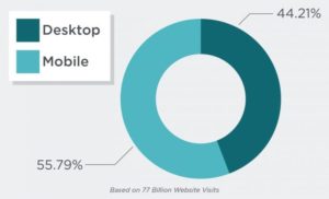
As more and more users are transitioning from desktop to mobile use, it makes sense for the brands to come out with mobile friendly pages.
Google Indexing
Initially, Google indexed the site based on Desktop experiences
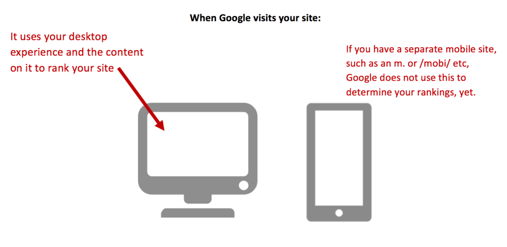
With the new update, Google will index and rank your website based on the content of your mobile experience. The image given below shows desktop and mobile experience for same pages and the way content is displayed on both the pages:
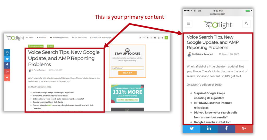
The above states that both versions show same content so when Mobile-first index kicks in, it wouldn’t make any impact to the site’s page. Google will see similar thing as the site is built up on responsive web design.
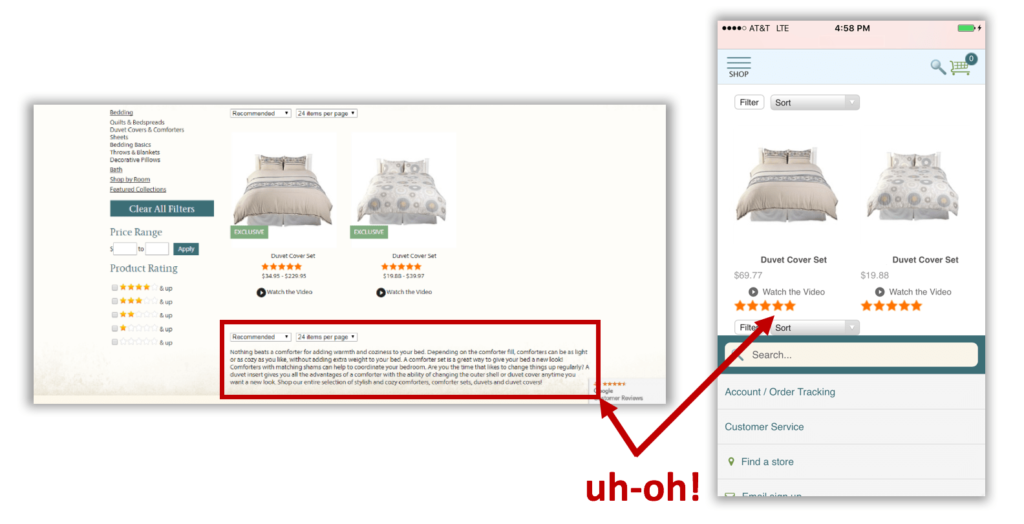
Similarly, the above image shows the site having negative impact because Google will use mobile experience on the right for indexing purposes.
Tips to help you prepare for Mobile-First Index
Learning and implementing about Mobile-First Index requires a detailed analysis and studies, here are the steps that help you get through update when it releases:
- Google’s Webmaster Blog Post
- Responsive Website design
- Hidden Content in Tabs and Accordion menus
Google has always been open about the changes that it wants to bring and encouraged people to learn from the blogs and news. Webmaster’s blog post is a good starting point to plan your activities when the update kicks in. However, there are two important points to note here: If you are already having a responsive website where primary content is similar to content seen on the desktop than you do not have to change anything. If the site shows different content on desktop and mobile, then it means that primary content needs to be changed and it requires some changes to your site.
Responsive websites are the ones which are mobile friendly; their primary content is similar to what content is seen on the desktop version. If your website already shows same content on desktop as well as mobile than you do not need to make any changes.
If your website is not responsive than there might be indexing issues and Google will not give good ranking to your site. In such cases, you can put primary content on your mobile site as Google will check primary source of content first.
Google has always been very clear about its update; they do not like to hide their content. According to their past update, they had strictly stated that the hidden content in tabs or accordions will not be considered for ranking purposes. But with Mobile-first index update, they plan to take it loose; it rightly derives from the following statement by John Mueller:
“So the mobile-first indexing will index the mobile version of the page. And on the mobile version of the page it can be that you have these kind of tabs and folders and things like that, which we will still treat as normal content on the page even. Even if it is hidden on the initial view.”
This is advantageous from the design and UX standpoint of view; it will also help organize large pieces of content.
Mobile friendly website design are the future, so it is greatly recommended to make a responsive website design that will help millennials easily browse through webpage across any possible devices you can merely think of


