Ecommerce businesses are all about market credibility and marketers well know that no one is going to hit the pod in the midst at least for some months. But, if the markets are targeted properly the response could be overwhelming and sometimes even with bigger instincts the results can be underwhelming. Most times the buying decisions are held subconsciously in the mind, so brands should take care of those things in mind. UX is the first and foremost thing a brand should pay strong attention to for its impacts your business sales tremendously. Stated below are few of the pointers to look for:
- Deficient Visual layout – Having a good site layout is one of the most important necessities for the site to look appealing to people. Visual colors help attract attention and elements like color, positioning of the products, shapes, sizes and more. The landing pages can be organized to give a strong impression to users of the website. Given below is an example of MailChimp’s Homepage:
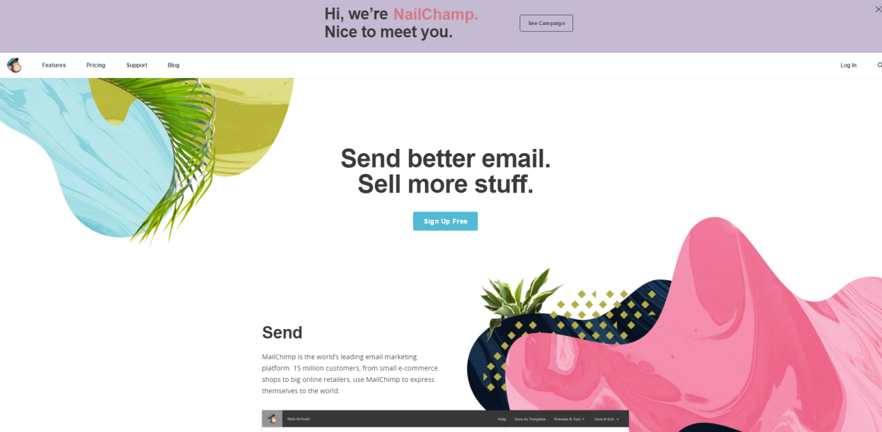
The above image clearly represent, where the user attention might go to. Some color options help customers to easily know what the site page is all about. The landing page goals are directed towards brands goals hence the actions can be taken accordingly. Following is one of the landing pages of the brand:
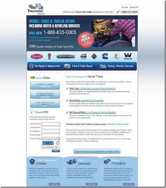
The below image grabs attention of the users where the brands want to highlight their selling proposition:
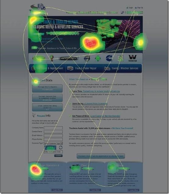
The above image clearly depicts where the highest engagement may attract the attention. The only demerit of this page is there are no actionable buttons where the users could click and get conversions. There are different online tools that help to identify and scan the visitor’s patterns. The landing pages should be designed keeping in mind the objectives of the landing page
- Undecided Value proposition – Brands should know there is no immediate selling, the brands USP is created to entice buyers into buying the products. Customers are looking to buy goods that are unique, hence idea for brands is to demonstrate their products with its usefulness and how it can be better opposed to other brands. A value proposition for the brands means to identify the need of the product, presenting the solution, showing the difference, providing the proof, etc.
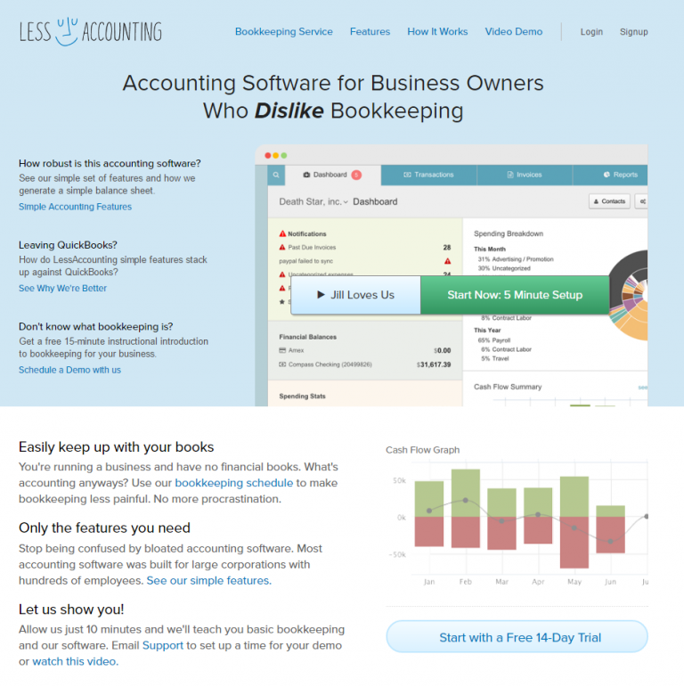
The homepage is dedicated to express the brands value proposition, the industry is dedicated to show common issue that brands and customers usually face.
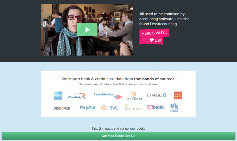
Industrial case-studies conducted by Invesp states how a well-craft value proposition can help to increase conversion rates by almost 90 percent. Ecommerce has a huge market and greater competition.
- Below average checkout process – Checkouts are the most important milestones when it comes to selling. This is the stage where customer finally buys your items and checks out. The abandonment rates are pretty high standing at an average 76.8 percent last year. The reasons behind abandoning the cart could be many:
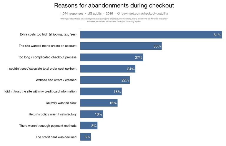
The ultimate goal is to make the checkout process for customers as easy as possible and eradicate loopholes. The longer the checkout process, the longer the chances for customers to reconsider the buying and abandon the cart. Sometimes even one click options may not be viable for all Ecommerce platforms. The customers also have the option to checkout as a guest, signing in some portals may give a lot of unwanted emails and hence customers resist the sign in. Look below the example of Asos:
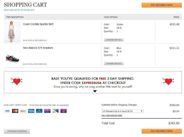
It clearly defines the total cost of items and provides costing for shipping too so the buyers would know clearly the total expenditure costs.
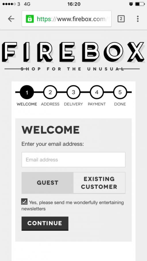
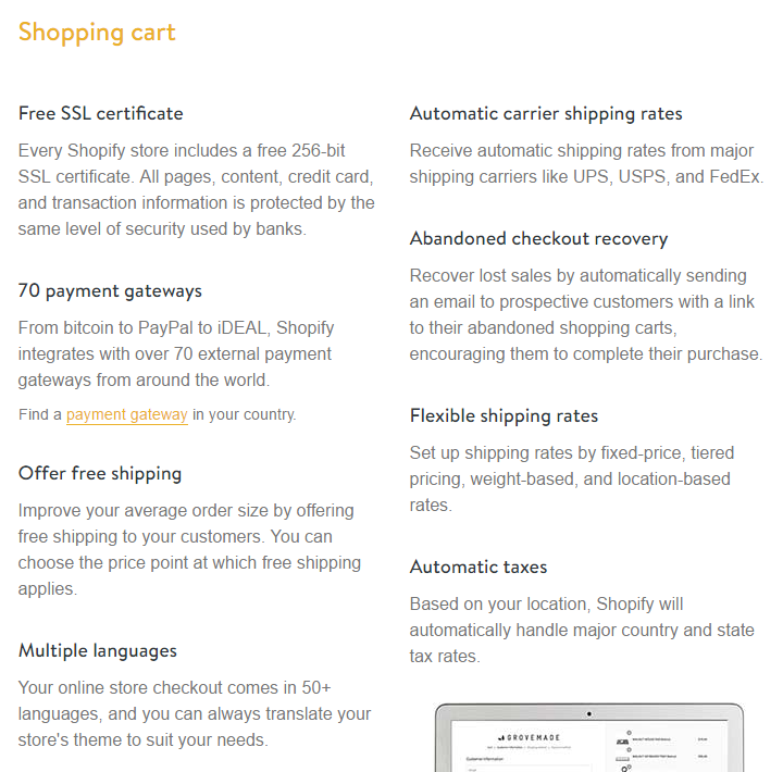
The above image shows an organized way of dealing with customers. The indications are clear cut and hence there is every chance of a conversion. The carts are created for checkouts and they are ultimately going to lead to a sale. Hence it is highly important to maintain them well and give good checkout process. A Shopify website offers good customizable options that ensure good functionality.
- Outdated website theme– The millennials are looking for what is latest, hence new upcoming website designs attract more attention.

The website that has old type of look can easily be concluded as an old business owner who is no more in business. Customers should find your site that is valuable in terms of providing information because they like credibility. Choosing a web design require a good market research and also the finest UX that you can provide. It gives your competitors the impression that you are competitive. Some sites simply use powerful images while some are heavily filled with content depending on the industries that they cater to, given below is Vera Wang’s homepage:
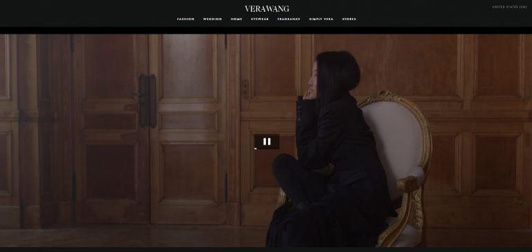
The captivating unique video on the site gives impression to user more than anything. If the site is outdated than nothing can make do the gap what your customer feels about the brand. Jeffrey Eisenberg, CEO of BuyerLegends.com, puts it as sites should focus on “persuasion” instead of “conversion”. He further noted “The ability to achieve truly dramatic improvements in conversion rates still requires a shift in conventional thinking. Design teams need to understand that while the goal may be conversion, the practice must be persuasion.”
Designing a perfect website is magical science that helps to cater to perfect balance of all the elements. It takes into account user prospects of the webpage and also helps to get healthy conversion rates.


